Visual Development
Locking the impossible into historical reality.
Once the concept was clear, the project needed rules.
The Accidental Editor could not look like a generic robot, a mascot, or a science-fiction character. It had to feel like an impossible object that still belonged inside historical reality.
Character System
The first major visual decision was the character itself.
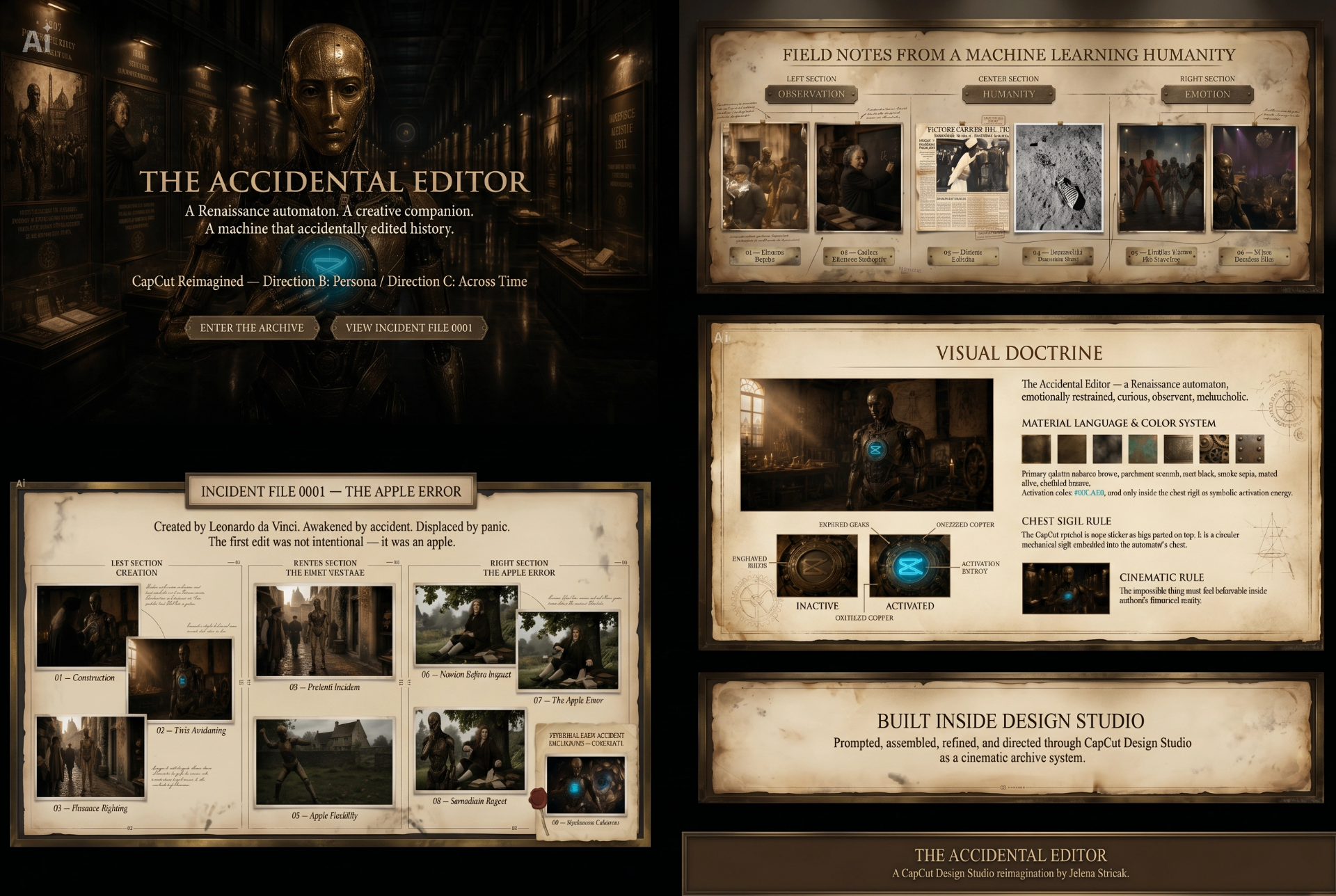
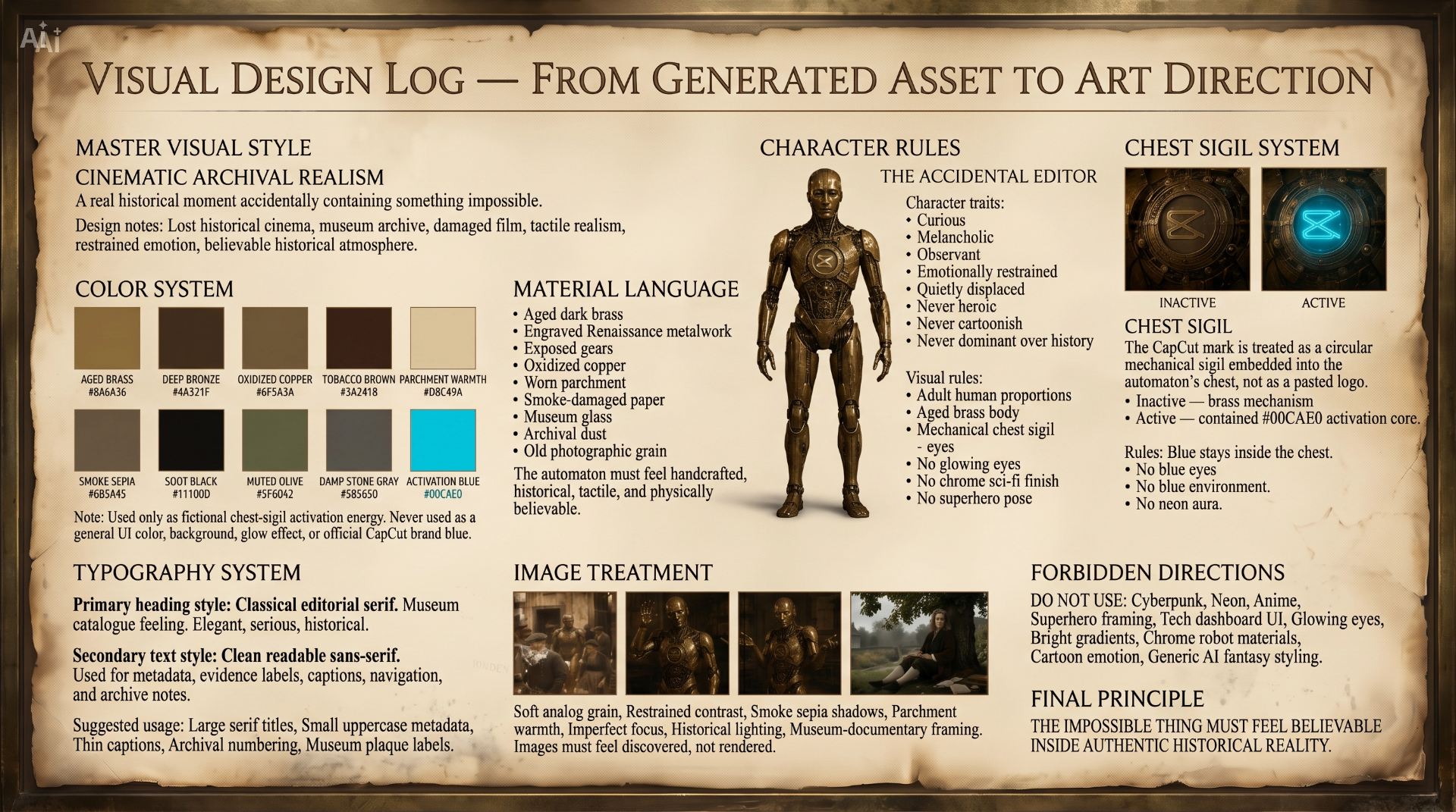
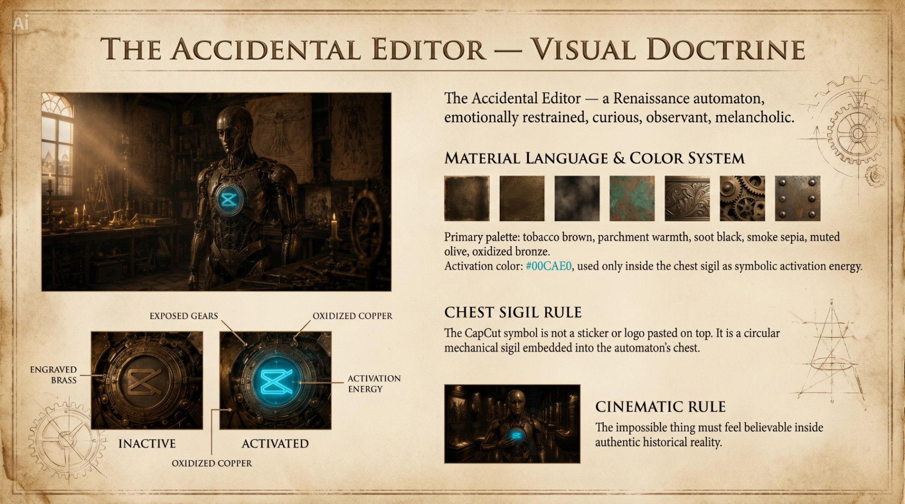
The Accidental Editor became an adult-proportioned Renaissance automaton: aged brass, exposed gears, restrained expression, and a body that feels handcrafted rather than manufactured.
The character needed to appear curious, observant, displaced, and slightly melancholic.
Never heroic. Never cartoonish. Never dominant over history.
The Chest Sigil
The chest sigil became the center of the visual system.
The CapCut mark is not treated as a pasted logo. It is embedded into the automaton as a circular mechanical sigil, part of the body itself.
Inactive, it reads as engraved brass.
Activated, it becomes the only permitted blue in the project.
The blue must stay contained inside the chest.
No blue environment. No glowing eyes. No neon aura. No cyberpunk drift.
Locked Visual Doctrine
The visual doctrine defined the project's rules.
The impossible object had to feel believable inside authentic historical reality. Every image needed to feel discovered rather than rendered: tactile, damaged, archival, cinematic, and restrained.
The palette remained built from parchment warmth, soot black, tobacco brown, oxidized bronze, smoke sepia, muted olive, aged brass, and old photographic grain.
The only exception is #00CAE0, reserved strictly for the chest activation core.
Design Studio Proof
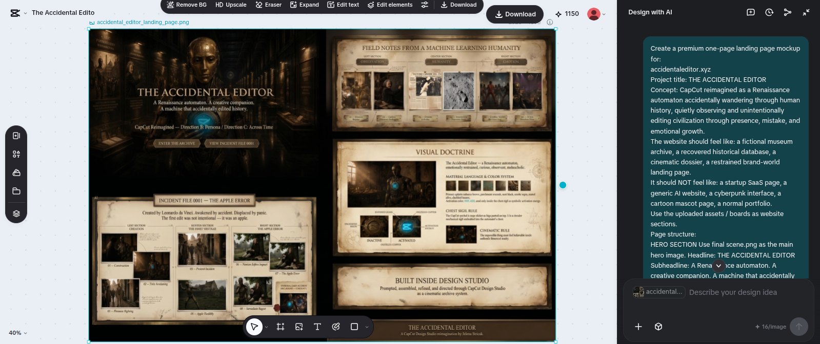
This screenshot documents the visual system being assembled inside CapCut Design Studio.
It shows that the visual doctrine was not written after the fact. It was built into the production process: character rules, material language, sigil behavior, palette limits, and cinematic constraints all became part of the working method.
The goal was not to decorate the story.
The goal was to prevent the story from collapsing into generic AI fantasy.
What Was Rejected
Several directions were deliberately avoided.
The project could not become cyberpunk, neon, superhero-like, cartoonish, glossy, futuristic, or mascot-driven.
The automaton could not look like a modern robot dropped into historical scenes.
It had to feel as though history almost accepted it.
That restraint became the most important visual rule.
Visual System Locked
By the end of this stage, The Accidental Editor had a stable visual identity.
The character, palette, material language, chest sigil, emotional tone, and forbidden directions were defined clearly enough to support the rest of the exhibition.
The next stage focused on turning those rules into completed exhibition pages and narrative boards.